Freelance artist, illustrator, writer, storyteller, cartoonist, caricaturist, portrait artist, digital artist, painter, blogger, and 10,000 hour logger. My challenge is to log 10,000 hours to master a skill in art. My plan is to document the progress, works, and achievements during this journey.
It’s been around 12 years since my first post detailing my journey of drawing and/or painting for 10,000 hours in order to master this craft. For those who are not familiar with this blog from my recent past, I aimed to reach 10,000 hours drawing or painting in order to master this craft. This is based on a popular theory better explained by Malcolm Gladwell in his book Outliers, which clearly had an impact on me. I remember back in August 2010 feeling so anxious and yet so eager to start this new era of my life. I didn’t know if I was going to be able to graduate from the School of Visual Arts or even to be successful in my new career. I really had no idea what would happen to me while achieving this humongous and ambitious task. The road has been slippery rocky and harder than I thought, but it has been even more joyful than I could have ever imagined. Not only that, my art skills are now beyond what I had ever dream of. This journey has been so interesting and mesmerizing that I don’t have the proper words to describe it. Not to sound poetic or pedantic but I think the main feeling I have is basically gratitude, for every obstacle and goal achieved, and even for every failure I’ve endured. This journey has been a privilege for me and although the right words elude me I just wanted to say thanks to everyone who has been there for me all along. I reached my goal of achieving 10,000 hours and I couldn’t have done it without my family, my friends, and believe it or not, my fans (There are a few out there! Yes, I couldn’t believe it myself). I unceremoniously accomplished possibly my greatest dream and here I am at my studio with no awards or any type of recognition (not that it was expected or deserved) but the anonymity of a dream come true and the pure joy of having been able to achieve it.
For consistency’s sake I will be posting The work I’ve created since my last entry to properly catalog them for my progression in mastering art. Let’s start with the ones that look back at me, portraits.
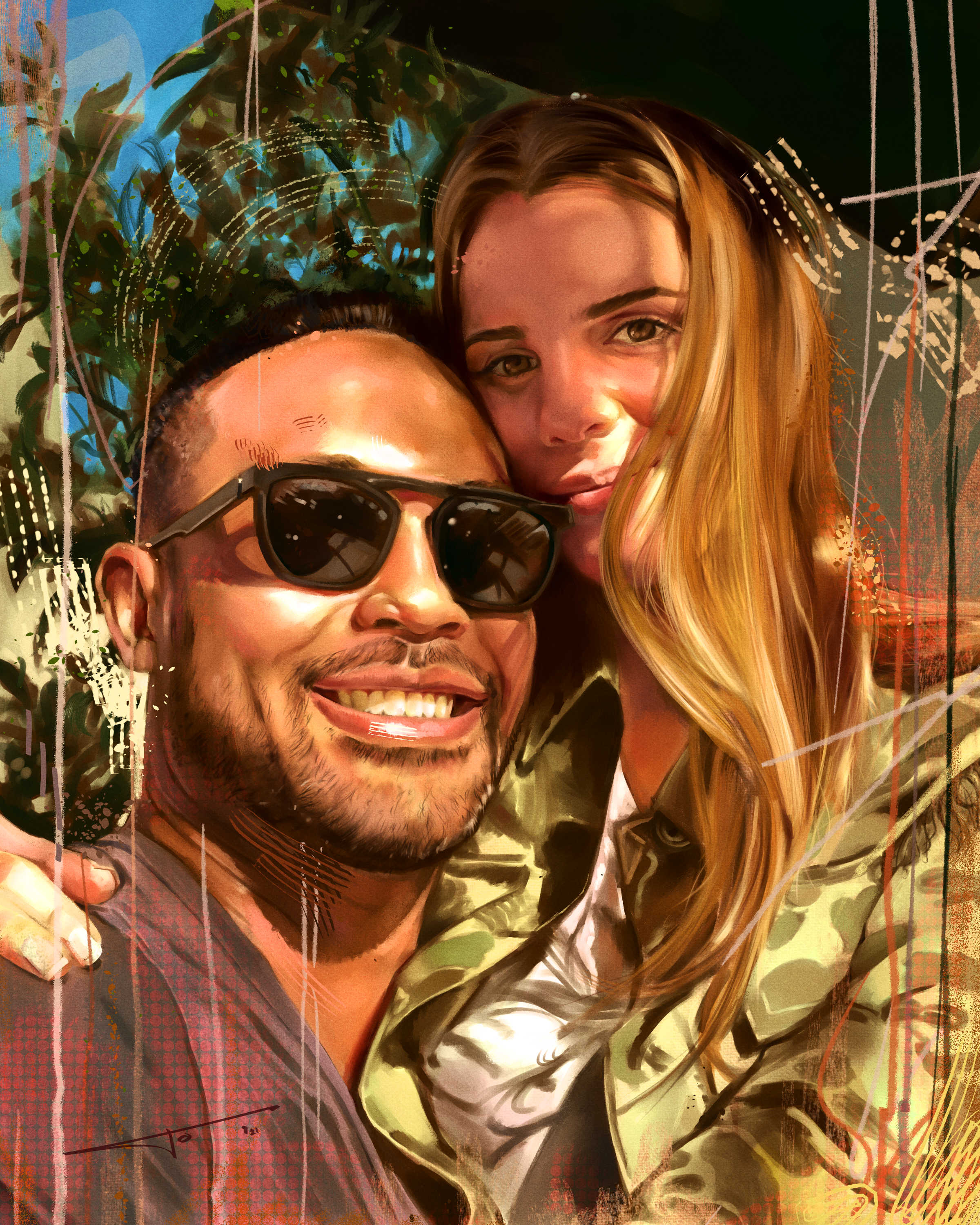
Portraits have always come natural to me, or at least I thought that when I started this journey. I’ve made around 60 professional portraits and although the improvement is highly noticeable, I know there is still room to grow and learn a few tricks here or there. I’ve done some oil paintings as well but my main focus has been in digital art. I’ve never told anyone but I think it is time for you to know, I just hate getting paint on my hands😁 Here are some of my recent portraits and a couple of time-lapse videos showing my process.
Another thing that comes fairly easy to me are caricatures. I’ve loved painting caricatures since I was in middle school. To tell you the truth I always wonder what could I have done if I just dedicated all my focus in studying this craft. That’s the thing about variety, you can never truly focus on one thing. In any case, my portrait painting surely helped in making these caricatures look as professional as they can get.
Of course by being a digital painter I can conjure all sorts of compositions based on reality or not. I’ve played around with styles and techniques, but if you know what you’re looking for you can recognize my style a mile away. I’ve also been very versatile with my work. I’ve painted superheroes, sport legends, landscapes, and even religious pieces. Let me go one by one.
As I stated before, my favorite tool with color is digital painting, but what I truly consider to be my strength is in drawing. I’ve drawn the human figure thousands of times and 12 years ago I was obsessed with anatomy to draw realistic characters, superheroes or not. Now, I’m leaning more on conceptual paintings and maybe not focusing on every muscle on the human body. Still, anatomy for artists is like a language, and you have to review it from time to time. In this case I was commissioned to paint the Justice League in acrylics. It was a challenge but I loved how it turned out.
I also love the fact that I can create scenes that could never have happened. This digital painting printed giclee on canvas is based on the Yankees. There is no photograph uniting all these icons together, and how could it be since Babe Ruth was from another era altogether. I named this “Baseball Legends” and it takes a very special place in my heart because it was commissioned by my brother in law. He was very specific on what he wanted depicted and I’m so glad I could make it happen.
As a bonus another legend, Diego Armando Maradona. I did this for a private commission and printed it on metal.
Another painting that I’m very proud of I did was based on a monument of my client’s father. Painting this scene was challenging because he wanted to show how important it was to have this type of monument on a well-recognized and transited avenue from my hometown.
I’ve never been recognized for religious paintings, but a good friend of mine commissioned me to paint not only his daughters, depicted on my portraits segment, but also a painting based on the Virgin Mary – Our Lady of Schoenstatt oil painting. If you think getting the likeness from a person (model or photo) is hard, believe me when I tell you that getting the likeness from another painting is even harder. You don’t have much room to paint it your style since it has to resemblance the face of the other painting. I’m really satisfied with how it turned out.
Comic covers have always been what I wanted to do for a living once I realized drawing comic pages just took me too much time to finish and the compensation wasn’t in par with my expenses. This may be due to the fact that I may have started this career later in life compared to other younger artists with no families to provide for and more time to spend on their art than myself. I’m 45 years old now and I must confess I don’t have the energy for all-nighters anymore as my competition does. Limits breed creativity and I found out that designing comic covers is not only something I truly enjoy but also something I can do quite fast and therefore sell it at a good price. This didn’t come easy since I had to study drawing, inking, lettering, composition, coloring, special effects rendering, designing titles and adding cover elements to make complete covers. Here are three examples of private commissions I’ve done.
It is also fun to make illustrations to sell as high-quality limited giclee prints, which I normally sell through my website www.journeystudios.net. As an example here's a Superman I recently did.
Remember my comic confessions? Well, for anyone who have no idea what I’m talking about I started these confession panels at the beginning of the pandemic. I still make them from time to time but I just can’t find the time to do them regularly. I plan to keep doing them because they are great for warmups and also I love to encapsulate some storytelling in just one panel. In other words, since I’m not doing comic interiors, this way I scratch my storytelling itch. Here are some of my latest ones.
I also landed a gig designing t-shirts for a special client. Tyson not only has become one of my most recurrent customers but also he is such a great guy who not only likes my designs but also respects my craft. I’ve always said that creating comics is a collaborative effort and we have done just that, as a team. I’m so proud of the work created so thank you for your trust and the opportunity to keep making these illustrations. Here is just one sample of the many illustrations I’ve done for him.
I never imagined that one person would be tattooing one of my designs on his leg. He approached me and was very specific of what he wanted. I put my heart and soul on this design because it was so personal to him. I’m so proud of that tattoo and I hope one day I can recognize my art walking by. I also have another design that I liked very much. Sadly, this for some reason never got made into a tattoo. It is based on Eddie from the band Iron Maiden, which I’m a huge fan.
Did I mention that I also did some book covers for my brother, who happens to be a writer? I love this gig, not only because I get to be a part of his journey but also because I found cover designs delightful. No wonder I always wanted to have a bookstore.
But what about comics? Yeah, the progress is very slow since it has been constantly interrupted by paid work. I can’t seem to find momentum for it and some of my stories have been left unfinished. It is a damn shame because I think the harder parts are already done, but that amount of time is something I just can’t spend right now. There is a Joker story in the works but sadly I won’t be showing any preview as for now. I guess the joke’s on me, right?
About my career in the comic book industry… I’d say timing played an important factor in not making me pursue an ongoing career in the industry. Don’t get me wrong, I’d love to dedicate my life by drawing comics, I just don’t think the time invested and the tentative payment per page are worth it as of now. Also, the comic book industry is not what it used to be and I just lost interest in participating. Social media didn’t help either. Now in order to get proper exposition you need to show your ugly mug and make reel videos for a living. I guess learning how to edit videos is mandatory nowadays, but to like making them is just another story.
Maybe I will be printing a coffee table book of this experience. I’m not hoping for it to be a commercial success and I’m sure I will be giving them away for free to my friends and family who have been supporting me since the beginning. Hopefully, I will be able to inspire anyone into believing that anything is possible and that your most precious weapon is perseverance and not to deviate from your dream in order to be able to stay consistent with your goals.
During this 12 year ride there has been many obstacles, some of them inside my head and some of them external factors beyond my control. There has been financial troubles, earthquakes, ideology wars, social media, and as a human race, we’ve endured a devastating pandemic. There have been many losses but also many wins as well. It has been hard I’m not going to lie, but to be completely honest with you this has been the second best decision I’ve made in my life. I know you can guess which one is the first. Marrying my wife has been a blessing and I couldn’t have gone along with this crazy plan without her infinite support. I love you Morole and my gratitude is limitless. Also, thanks for giving me my best joy, my children. They were born during this challenge and they know that his father is a happy artist and that he draws and paints for a living. They never knew the other side of the coin when I felt frustrated and sad for not being able to do what I loved. Many thanks to my parents for their endless support and to my brother and sister and my family as a whole for always been there for me. There are many dear friends that have been with me during this decade or so that I’d need another entry to properly thank them. Since this is my last entry then I guess I will send you a copy of my book once it’s finished. In any case, You know who you are. A very special thanks to Eduardo Risso who has not only been a great mentor but also a great friend. He is also responsible for reinforcing the idea to embark on this journey. Also, whenever I create a piece I hear his words "Think before drawing"
I’ve done a lot of things, some of them I wish I could take back and some of them I’m so happy that I got the chance to do them. There are some that I still wish I had the courage to try. Well, if there is a lesson here somewhere is that anything is achievable if you put your mind into it. You know what I haven’t done? I had never stop drawing ever since.
Like Chazz Palminteri wrote in his play A Bronx Tale: “The saddest thing in life is wasted talent, and the choices you make will shape your life forever”.
Well, is it? I honestly don't know anymore. Don't get me wrong; personally speaking, this is the happiest and most comfortable I've ever been in my life; professionally, it has been more challenging that I anticipated. Yes, I have my preferences on regard of what I want to draw and/or paint, but it is still art nonetheless. Sometimes I have to make ends meet and work on something I'm not that enthused, but it beats working 9 to 6 in a cubicle, not that there's anything wrong with that. I started this blog to showcase my work and also to tell you a tale of perseverance. Also, my goal was to log 10,000 hours in order to become a master in my craft. I have approximately 8863 hours, so I'd need to log 1337 hours more to officially end this self-appointed challenge. I've been away from writing these entries for two years now; needless to say I need to show you what I've been up to. In order to showcase my work I will divide each block on a type of activity. I've been focusing on comic illustrations, digital paintings, portraits, and caricatures. I've been also making some concept art, comics, and personal commissions that I won't be able to share here either because they are incomplete or I have, formally or informally, stated a non-disclosure agreement. I hope after discussing what I've been doing I can honestly answer if this journey has been worth it so far.
Let's start with a project I made out of love. The Flash, famous speedster from the DC Universe and member of the Justice League, turned 80 years in 2019; so I decided to draw a cover illustration commemorating the character in his birthday. I also love running marathons so I took inspiration on these events for the theme by including 80 speedsters. It took careful planning to sort this list out and I couldn't have done it without the help of my writer and friend, Marcelo Cury. The cover was very well liked and shared on social media, especially for Wally West fans (third Flash to honor the legacy) since I deservingly put him in front of the pack as the fastest speedster of them all. My idea for this piece was to get the attention of some art editors or at least get my work out there for future followers and fans.
Flash # 1000 - 80th Anniversary Edition Cover
Another highlight of 2019 was from my "Icons" collection. I had a profound Joker phase. Since my Icons digital paintings tend to be more realistic in nature I couldn't help to include Mark Hamill as the Joker. For those who do not know, Mark Hamill (Luke Skywalker) did the voice for the Joker in the Batman Animated Series and other animations as well. Some people, including myself, have claimed that he is the best Joker of all. I took as reference a younger Mark Hamill playing the Trickster on the Flash TV series but painted him with the features of the Joker animated version. The end result was better than I anticipated but the highlight of this story was when Mark Hamill himself actually praised my work and thanked me on Twitter. Whenever someone mentions what a great idea would've been for him to play the clown prince of crime, he immediately posts my painting. To say that was one of the happiest days in my professional life so far would be an understatement. I mean, how many times you have the chance to interact with Luke Skywalker and by doing so getting a, and I quote, "Fantastic work Jose, much appreciated." It made my day, hell, it made my year!
Mark Hamill as the Joker
Mark Hamill's Tweet Reply
Speaking of my "Icons" collection, I will show you my recent additions. 2020 was a slow year for these digital portrait paintings of pop icons but I managed to add a few I'm very proud of.
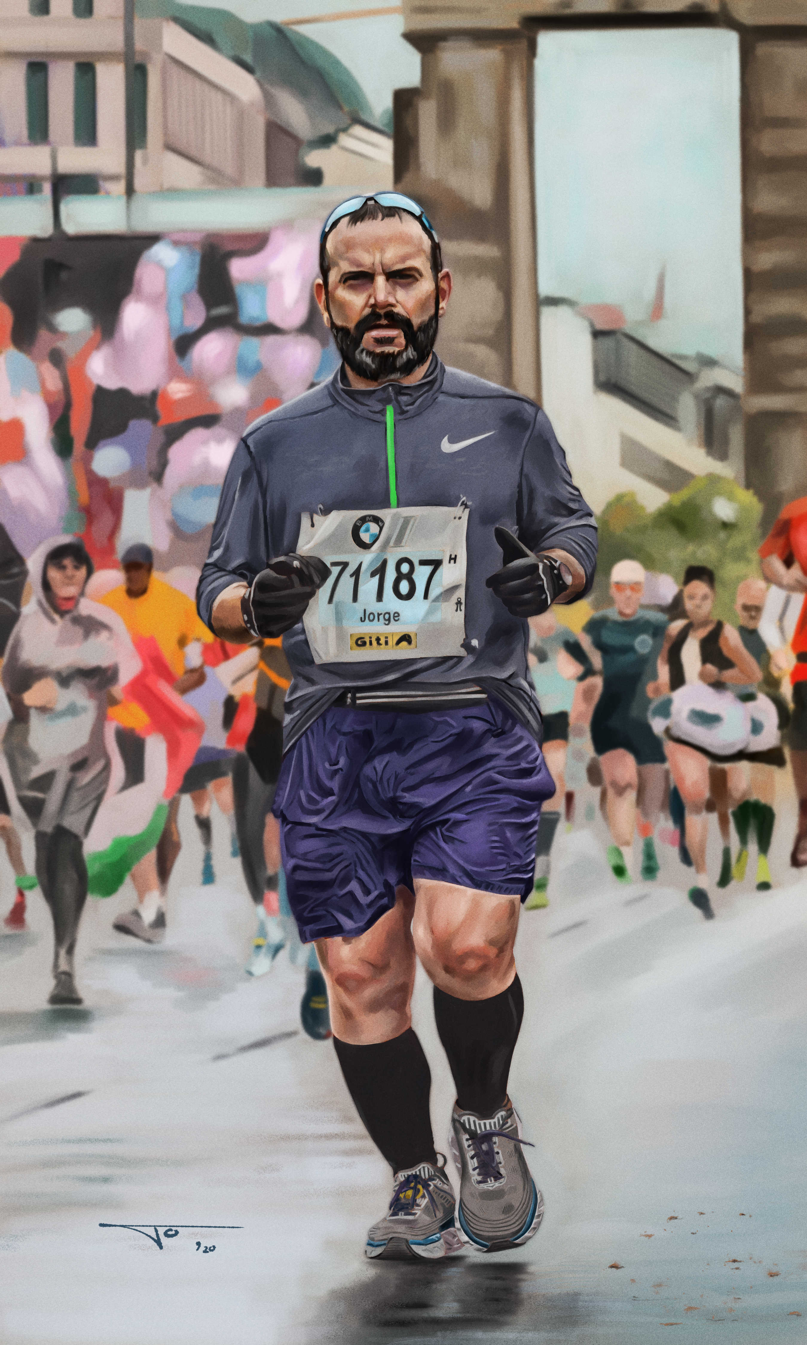
If I've improved substantially in something is portrait painting. One thing of being an artist is that you never stop learning, but for that you need to study, either by taking a class or by meticulously examination of other artists' work. In my case, I'm always looking for portrait artists to get inspired and whenever I have the chance I take classes to improve my style or at least to take me out of my comfort zone. My digital portraits market is mainly in Ecuador, and although I have struggled in making my audience understand my artistic approach, my pieces have become more known to my potential customers. I've been taking some commissions during these two years and I will be showcasing my favorite ones.
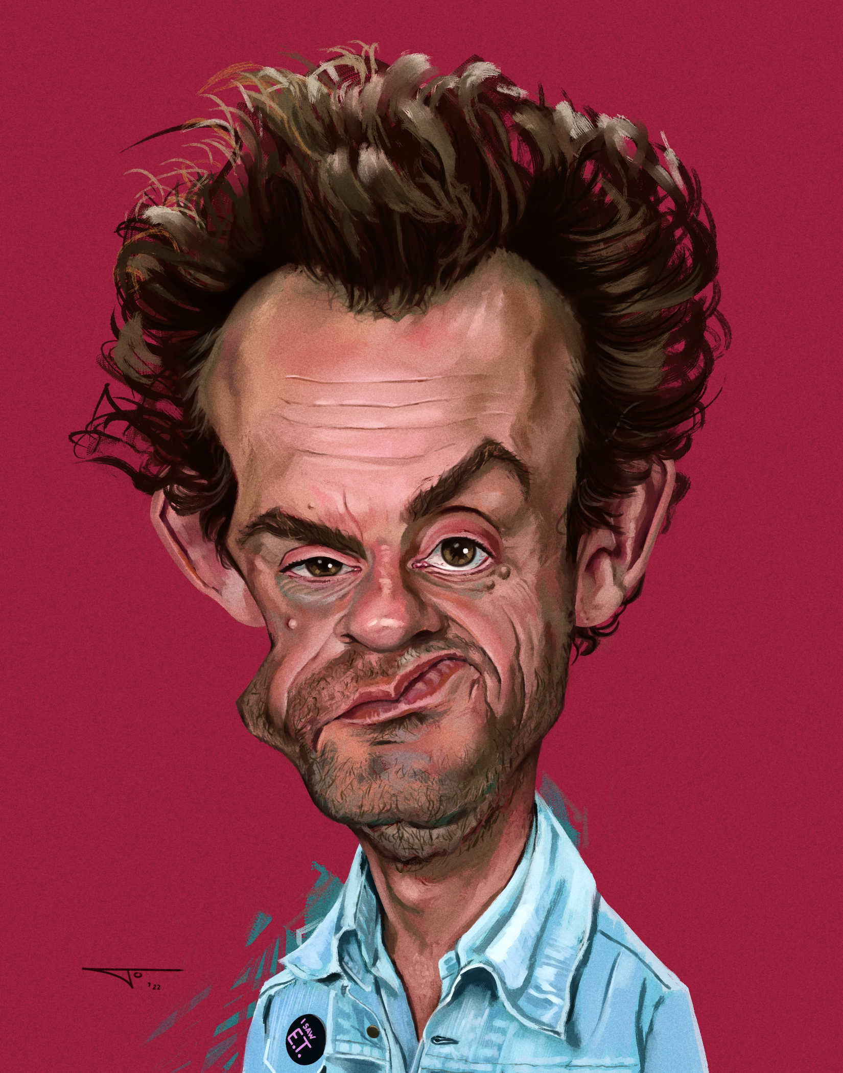
Now, one thing I'm pleasantly surprised is how much I've improved in my caricatures. If I'm being honest, I have loved to draw caricatures since I was 8 years old. Somehow it comes fairly easy to me to exaggerate features and still maintain the essence, or the likeness, of that person. Looking back at my early caricatures I understand how crude they were, nevertheless, they always made someone laugh when the person in the drawing was recognized. I would love to do more of these commissions not only because I enjoy them but also because I want to further improve on this technique. One of my strongest suits now is that throughout the years I learned to paint realistic portraits, so when you paint a caricature this way it makes the final product seem much more professional. Here are my favorite caricatures in these couple of years.
I happened to assist to two conventions during this time, Florida Supercon in 2019 and C2E2 in Chicago in 2020, right before the pandemic started. I always have a good time in these cons, although I can fairly assess that the enthusiasm for these types of events have wound down. In any case, it is a great place to meet colleagues, fans, and heroes. C2E2 may be my third most favorite comic-con, but due to the increasing threat of the Covid-19 virus in late February, when it was held, attendance diminished substantially. It is hard to imagine these packed events happening anytime soon now.
Me at Florida Supercon 2019
My wife at C2E2 2020
One fun project I was commissioned to do was of a Felix the Cat pop art acrylic painting. I always like to challenge myself with new ideas and this one I really enjoyed. I though it would look cool to print vintage comic strips and covers of Felix The Cat on a canvas of 30 x 40". Take into consideration that I had to arrange all those in Photoshop to obtain the desired composition. After that, I painted a huge Felix the Cat in acrylics and it turned out very cool. Like I've said many times before, I'm not much into Pop Art. My main critique is that they tend up to be just decorative pieces without a strong message. Whatever Pop Art's message of mass consumption was, it was done more effectively in the fifties and sixties when it was more relevant. They look really cool though and I have to admit that I enjoyed making this and wouldn't mind making more if the opportunity presents itself.
Felix The Cat
One of the perks of this job is that during your breaks you can come up with work for YOURSELF. In order to understand this one you have to be a Flash comics fan. You see, a life objective of mine is to be able to draw one published comic for the Flash, or at least a cover. During one issue there was a missed opportunity to include my favorite Flash, Wally West, possibly due to editorial meddling and conflicts. I decided to draw, ink, and color the character and paste it onto this published page of the Flash issue # 761. It was a fun drawing that let me vented all of my frustration of DC Comics choices regarding this character.
Flash # 761 - The Return of Wally West
Another cover I have to mention is a commission I got for a brave kid that is battling ATRT, which is a primary central nervous system tumor. Jonathan is constantly battling this disease and despite everything he has endured, he has such a great attitude towards this. He is a big fan of the Hulk, so his uncle asked me to include him right next to Hulk in a custom comic cover. Once I knew about this disease I immediately donated what I got for the commission to this noble cause. I realized that making him smile is compensation enough. I put my heart and soul into this piece and to my understanding he really liked it. If you want more information to help him, his Instagram account is @jonathansjourney2020
Hulk and Jonathan
And one last painting for the masses. At the end of this crappy year we were all excited for The Mandalorian second season, and let me tell you that Jon Favreau and Dave Filoni didn't disappoint. They brought my love for Star Wars back. Here is a painting of Din Djarin and Boba Fett for his immaculate return to the Star Wars universe.
Boba & Mando
Last but not least, let's talk about the pink elephant in the room. The Covid-19 virus was something the world did NOT expect. We weren't ready for it and some people suffered a lot for it. When the pandemic broke out mid march and the quarantine started, it was really tough to overcome the fear, anxiety, helplessness, boredom, and plain uncertainty. I always draw and paint at my studio and realized soon enough, after a couple of weeks of spending time with my family and trying to solve primary logistics tasks, that I could work from home without a problem. Some people didn't get that opportunity. So I started drawing and running (on a treadmill) whenever I could. Both activities were therapeutic. Instead of watching the news, fake or real, all day I decided to spend most of my time doing these activities and while spending time with my wife and children. They were a tough couple of months but I am grateful I personally didn't suffer immediate loses and that we could be together as a family to overcome such a hard time. I started my quarantine project, not thinking on sales but to somehow entertain my fans and myself as well. My "comic confessions" started as a small challenges but it grew to become an ongoing project. Basically is one panel (using a format established in the infamous comic Heroes in Crisis), in which the character either confesses or makes a statement in front of a camera. The words, courtesy of my associate Marcelo Cury, turned out to be more ambitious that I had foreseen. I have drawn 90 characters or 10 pages so far, so I would expect to at least do 10 pages more for next year. I hope I have provided some distraction to people around the world who have been less fortunate than myself. Here I have made a big file containing the 90 characters.
So, is art worth it? Hell yeah it is! Maybe it is not as glamorous or meritorious as I would have imagined. Maybe it takes a little bit more time than anticipated to get your work out or to get your big break. Maybe I live in a country were my skills are not yet appreciated or understood correctly. And maybe, just maybe, I'm trying so hard to draw and paint what I enjoy more than what the market is asking me to deliver. Yes, maybe it is hard, but tell me of something worth doing that it is not. In the direst of times I understood now that if you are an artist by heart, becoming one is just unavoidable, or at least it should be. If you fight against it, you will end up repressed and unhappy. So for me it's not actually a choice. I'm an artist and I have to make it work, for me, for my family, for the people to happen to like my work, and for those who don't really care one way or the other, but for a glimpse of a second they find solace by looking into one of my pieces. Did you notice that when the world stopped, art did NOT! And why do you think that is? Art is expression; art is a form of communication. Some of my work may seem banal in nature, but I have received joy, happiness, admiration, and inspiration through comments regarding my work. So art won't stop even if the grinds that makes the world "turn" does. So why would I bother to stop it in my life? I will continue to work hard to achieve my goals but if that doesn't happen, I can now testify that art IS indeed worth the journey.